Best Slideshow Maker for Facebook Photos: Free Tools
Facebook is still the biggest social network. Photos get attention but a slideshow with music gets more. It tells a...
Gadgets & Technologies Are Together

Want to know how to create engaging slideshows? This is a challenge for most people. They put hours into making slides. However, when placed in front of the audience, no one is watching! People are on their cellphones. They converse with one another. They are yawning. This is painful when it occurs. All of your effort seemed to have been in vain. The primary reason is that majority of the slideshows are dull. Too much text. Ugly colours. No flow. No story. However, the reality is that.
Creating a great slideshow isn't rocket science. Avoid being a designer! Don't have to buy expensive tools. It takes a few easy tips to learn. I'll let you know those tricks in this article. I will teach you how to create a slide show that will have people watching. I will cover all of the elements, from the title slide all the way through to the end. So read on. The next time you present, it will be your best yet.
Before we learn how to make engaging slideshows, let us look at why most fail.
Read More: How to Fix Slideshow Layout Issues on WordPress

Your title slide is the first thing people see. It sets the mood. If your title slide is boring, people will expect a boring presentation. So you need to learn how to make a cool PowerPoint title slide.
Here are simple tips.
Do not crowd your title slide. Less is more. Put your title in the centre. Use one strong image in the background. Or use a clean solid colour.
Your title should be big and easy to read. Use a bold font. Make sure the text stands out against the background.
Use colours that match your brand. Or use colours that create a mood. Blue gives a professional feel. Orange gives energy. Black and white look classy.
Put your name or your company logo at the bottom. But keep it small. Do not let it take attention away from the title.
A good image makes a huge difference. Do not use blurry photos. Use clear and sharp images. You can find free images on Unsplash or Pexels.
Let us say your presentation is about digital marketing. Your title is "Digital Marketing Trends 2026."
That is a cool title slide. It is simple. It looks professional. It grabs attention.
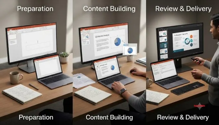
Now let us learn how to create a PowerPoint presentation step-by-step. Follow these steps. You will get good results.
Many people open PowerPoint first. This is a mistake. You should plan first.
Get a pen and paper. Write down these things:
Once you have clear answers, you are ready.
Make a rough outline. List the main points you want to cover. Think of it like a story. There should be a beginning, middle, and end.
For example:
Open PowerPoint. Go to the template section. Pick a clean and simple template. Do not pick flashy ones. Simple templates work best.
This is your first slide. Follow the tips I gave above. Make it cool and simple.
Now add the slides for your main points. Follow the rule of one idea per slide. Do not cram everything into one slide.
This is very important. Good visuals make your presentation engaging. I will cover this in detail later.
Use these carefully. A simple fade transition is good. Avoid spinning, bouncing, or zooming effects. They look unprofessional.
Go through your slides. Check for spelling mistakes. Check if the flow makes sense. Remove anything that is not needed.
The slides are just a tool. You are the main show. Practice your speech. Know what to say for each slide.
Save your file. Save it again in a different location. Also save it as a PDF. This way you have a backup.
Now let us talk about design. You need to know how to make your PowerPoint look aesthetic. This does not mean it should look like an art gallery. It means it should look clean, pleasing, and professional.
Here are the rules.
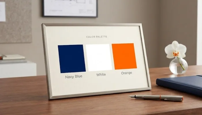
Pick two or three colours and stick to them. Do not use rainbow colours.
Here is a simple combination:
Do not fill every inch of the slide. Leave empty spaces. This makes the slide look clean. It also helps the viewer focus on the important parts.
Images should be clear. They should be relevant to the topic. Do not use clip art. It looks outdated.
This is a design rule. Imagine a grid of nine boxes on your slide. Place important elements along these lines. It creates balance.
Icons are small symbols. They represent ideas. For example, a light bulb for ideas. A handshake for partnership. They make your slides look modern.
This is the golden rule. Do not write paragraphs. Use short bullet points. Use keywords. Let your speech explain the details.
Let us say you are making a presentation about healthy eating.
This is how to make your PowerPoint look aesthetic. It is simple. It is clean. It looks professional.
Here are more design tips. These will help you make engaging slideshows.
Use High Contrast
Your text should stand out against the background. Dark text on light background works best. Or light text on dark background. Avoid low contrast like grey text on white background.
Use Large Font Size
Your audience should be able to read from the back of the room. Use at least 28 points for body text. Use 40 points or more for headings.
Use Visual Hierarchy
Make the most important elements big. Make less important elements small. This guides the viewer's eyes.
Use Data Visualization
If you have numbers, use charts and graphs. Do not just write numbers on the slide. A bar chart or pie chart is easier to understand.
Use Videos
Sometimes a short video is better than text. A 30-second video can explain something better than ten bullet points.
Use Quotes
A powerful quote from a famous person can inspire your audience. Put it on a clean slide with the person's name below.
You May Also Read: How to use slideshows for storytelling in marketing
Design is half the battle. The other half is content. Here is how to make your content engaging.
Start with a Hook
Tell a Story
People love stories. Structure your presentation like a story. Start with a problem. Show the struggle. Then show the solution. End with a happy ending.
Use Simple Language
Use basic words. Do not use fancy words. Your audience should understand everything easily.
Use Examples
Examples make things clear. If you are explaining a concept, give a real example.
Use Humor
A little bit of humor makes your presentation fun. But do not overdo it. Keep it professional.
Engage Your Audience
Ask questions. Ask for a show of hands. Make your audience participate. This keeps them awake and interested.
End with a Call to Action
You do not have to use only PowerPoint. There are other tools. Here are some options.
Microsoft PowerPoint
This is the classic tool. It works well. It has many features. Most people know how to use it.
Google Slides
This is free. It saves your work online. You can work with others at the same time. It is great for teamwork.
Canva
Canva has beautiful templates. It is very easy to use. You can make professional slides in minutes.
Keynote
This is for Apple users. It has a clean interface. It produces high quality presentations.
Let us list the common mistakes. Avoid these to make engaging slideshows.
I have said this before. I will say it again. Too much text is the biggest mistake.
Do not use fancy fonts. They are hard to read. Stick to simple fonts.
Animations should be used sparingly. One or two is enough. Too many look cheap.
Always save a backup. Technology fails. Be prepared.
Your slides are for the audience. Not for you. Do not read from them. Know your content.
Do not put too much on one slide. Break it into multiple slides.
Your images should support your message. Do not add random images just to fill space.
Before you present, go through this checklist.
If you can answer yes to all these, you are ready.
Making engaging slideshows is a skill. Anyone can learn it. You do not need to be a designer. You just need to follow the rules.
Remember the key points:
I hope this guide helped you. Now go and create your slideshow. Use the tips on how to make a cool PowerPoint title slide. Follow the steps on how to create a PowerPoint presentation step-by-step. And remember how to make your PowerPoint look aesthetic.
Your audience will thank you.
Good luck.
Use at least 28 points for body text. Use 40 points or more for headings.
It depends on your time. A good rule is one slide for every two minutes.
Yes. Videos are great for engagement. Keep them short.
Both are good. Google Slides is free and cloud-based. PowerPoint has more features.